ON WALLPAPERING AND WALLPAPER HANGING
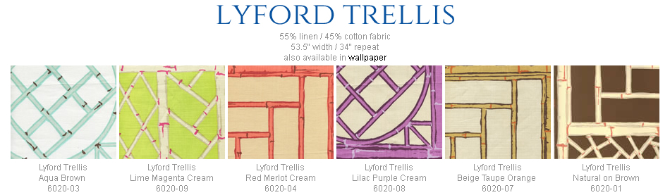
We started work this week on the main reception rooms for The Hillsboro Club (www.hillsboroclub.org), which we hope will be just the loveliest reception area imaginable—at any rate, our idea is built around a plan based on a beautiful wallpaper from China Seas “Lyford Trellis” which is one of their oldest designs and one of my favourites.
For this job, we had it specially coloured with a beautiful south-seas-ocean blue background with the bamboo designs in white with highlights in beiges, because the colours of The Hillsboro Club are a brilliant turquoise and white. These colours are used in their awnings in bright happy stripes, and they show in the windows of the club. They, themselves, however, would be too shocking as the colours of a room—remember the pictures I showed in the post on Aqua?—although they look lovely when seen near the blue that we chose for the background of our paper.
The first thing we had to do was come up with an artist’s rendering of the wallpaper in the colours which we wanted.

And then this was sent to China Seas for them to use as the guide. This required a strike-off because the colours in the paper had to match the colours in the rendering exactly, since the ceilings in the main living room were coffered with quite large beams separating the squares. These would be painted by an artist to match the wallpaper with a design taken from the wallpaper, so that, in the end, the effect would be almost of a giant trellised garden room with the ceilings held up by trellised beams.
 |
| "Before" picture of Hillsboro Club's Living Room |
Step one was to remove all those hanging fixtures and replace the giant 1970’s can lamps with small, almost unseen, down-lighters that could be controlled by dimmers. Rooms are most beautiful when they are lighted by area lamps, so having the ceiling lights dimmable was imperative. That necessitated removing the wooden squares between the coffers and putting up the lights and replacing the wooden squares with new ones, which would all be painted in a beautiful white paint, a white we call “Hillsboro White” because we use it everywhere. We used an architect for this, Joseph E. Dixon, III, from New York, who in addition to a lighting and paneling plan for the ceiling,

also redesigned the railings at the stairway entrance and the shutters which would go over the front windows.

Hint #1—using the same colour on woodwork and ceilings everywhere keeps maintenance easier, and in a hotel/club such as this, corners and edges get banged up all the time by luggage rolling racks, tennis racquets and golf clubs and just ….people. Hence…Hillsboro White which is used in a matte finish on walls and ceilings and in a semi-gloss finish on woodwork and anyplace that is to be perceived as woodwork—such as the wall below a chair rail when the idea is to make all of the dado look like wood. In this case, we wanted the very strong columns that are a main design motif of the room to be perceived as wood as would be the extruded pediments above them. These were part of the original scheme of the room and would fit in very nicely with our plan.
Hint #2—always, and I mean always, use the best painter you can afford—never, never, never skimp on your labour. As I have said many times in this blog, your labour is your most important part of your design—I mean the fabrication of your design, of course. You have to come up with the design first, but if you are any good in this field, you will be able to find good fabrics and such at a cheaper level, but not your labour. On this set of rooms, we are using Gary Lambert, Jr., (561-312-4325) whose father was a fabulous painter before him. Not only is he painting the ceilings and woodwork, etc., but he is also preparing the walls for the wallpaper hanger—absolutely of first importance. Here you can see him conferring with the decorative painter, in this case, Ivan Rizov, over some walls which have become problematic. It is imperative that these people be able to work together. Lee Cushnie, the wallpaper hanger (516-236-2959), doesn’t really like to work on walls that are not prepared by Gary, since both of them, and myself too, are fanatics about preparation. Here are the steps used, but just knowing the steps is not enough—get the best people who will not scrimp here.

Step #1: Go over all walls, finding any irregularities (ie. former paint drips, tiny cracks, etc.), sanding all these and general walls smooth, spackling as necessary, and sanding again. Paint walls in one coat of flat wall enamel, and then, just before hanging paper, size the walls. Certain wallpapers, especially Chinese hand-painted ones or antique reproductions from companies such as Mauny or Zuber, require lining, and this should be done horizontally, so that there is a firm bond between the two layers. (If you are thinking of ever taking these murals down, you should canvas line the walls before putting up the paper liner—this extra layer is usually hung vertically.) The paper we used on this job, the Lyford Trellis, is vinyl coated, so it does not—actually should not—have lining.
Step #2: Lay out the paper for the final time—you will have already done this when you planned your room, but this final layout is important, since it exactly lays out where the stopping and starting points are.
 |
| Lee Cushnie laying out the paper |
 |
| and then cutting the paper |
Above you see pictures of our paper hanger, Lee Cushnie, laying out the paper on the floor. He has taken some of the boards from his table and laid them down to put the paper on for cutting. Ordinarily, we like to double cut when the design match is so important, but these are sheet rock walls, and the double cutting could go through both of the paper layers and open up little cuts in the rock which could later expand and contract, ruining the paper. Notice how he is lining up as he goes.


Here you can see the paper hanger hanging up the sheets, carefully lining up the matches. Because this was a straight repeat paper, it was easy to line up the tops, but because we did not design the paper for the room, there were places where we had to cut away some of the paper and put in a part of the design so that the design would work best. This was done on the chimney extrusion, although I don't think you would know we did it unless i showed you.
The paper is lovely hung. I will show you more pictures when the room is complete. For now, I will also show you the artist, Ivan Rizov, (www.nimbusstudio.com) 561-655-0955, studing the patterns he has made from the designs of the paper which will be fit onto the broad beams. Can you see the little pin pricks which will make his pattern up there?

 |
| Ivan Rizov transferring design onto wall |
Until next time......
XOXOXOX
LETA
No comments:
Post a Comment